OCP Academy needed a new identity reflecting its modern, purpose-driven approach to education. Their existing logo lacked personality and professionalism, a significant challenge for a brand aiming to build trust.
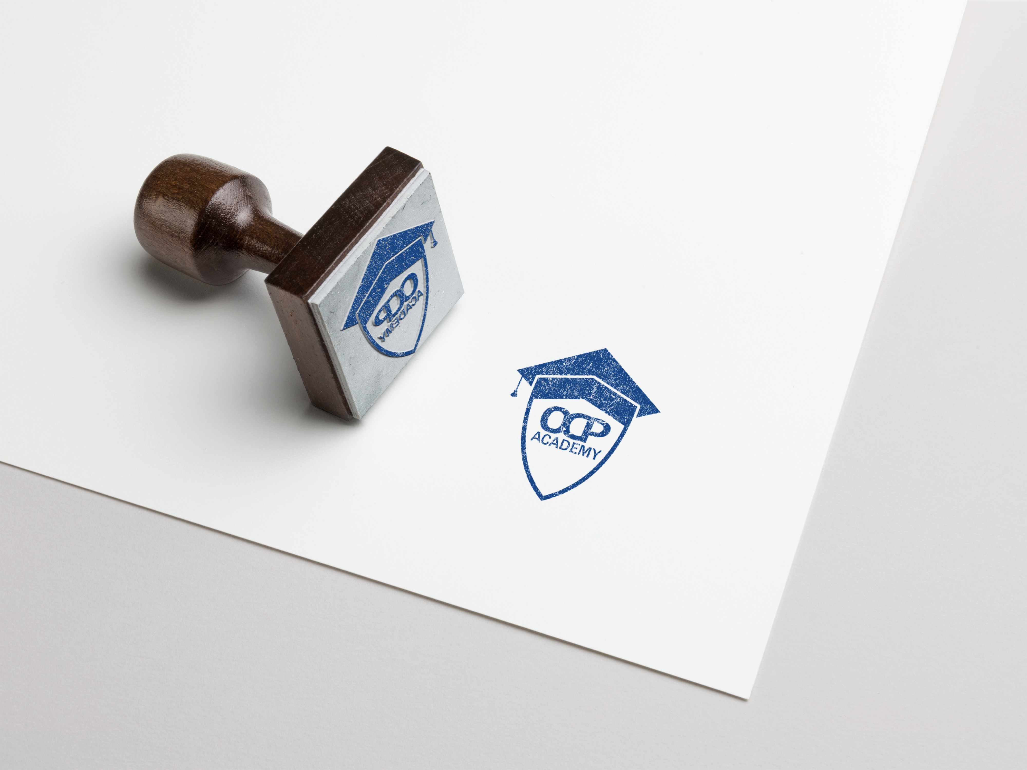
After researching design trends in education, I developed five logo concepts rooted in minimalism and strong typography. The final direction combined a graduation cap and shield in a clean, scalable design with Montserrat type and a navy blue color palette.
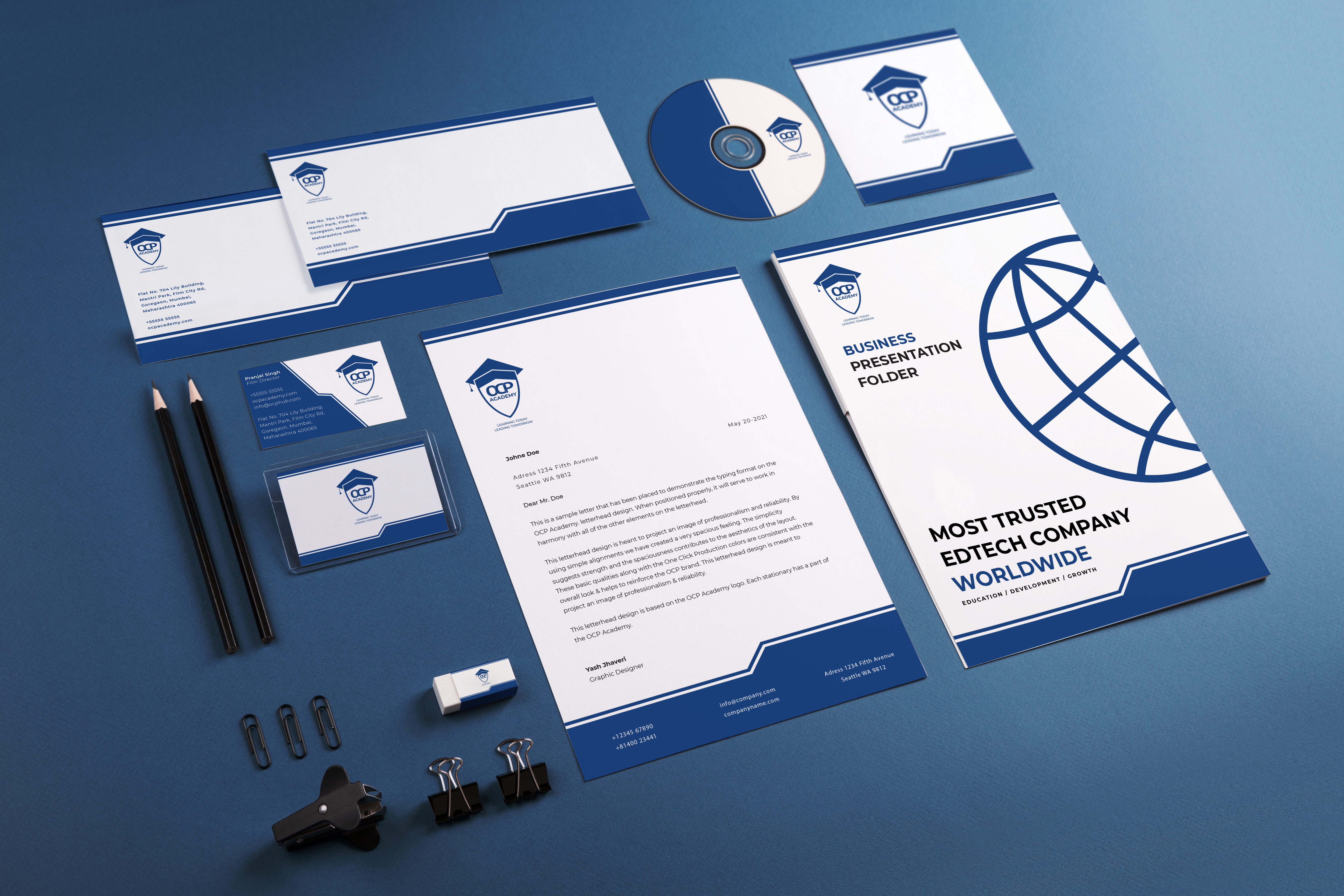
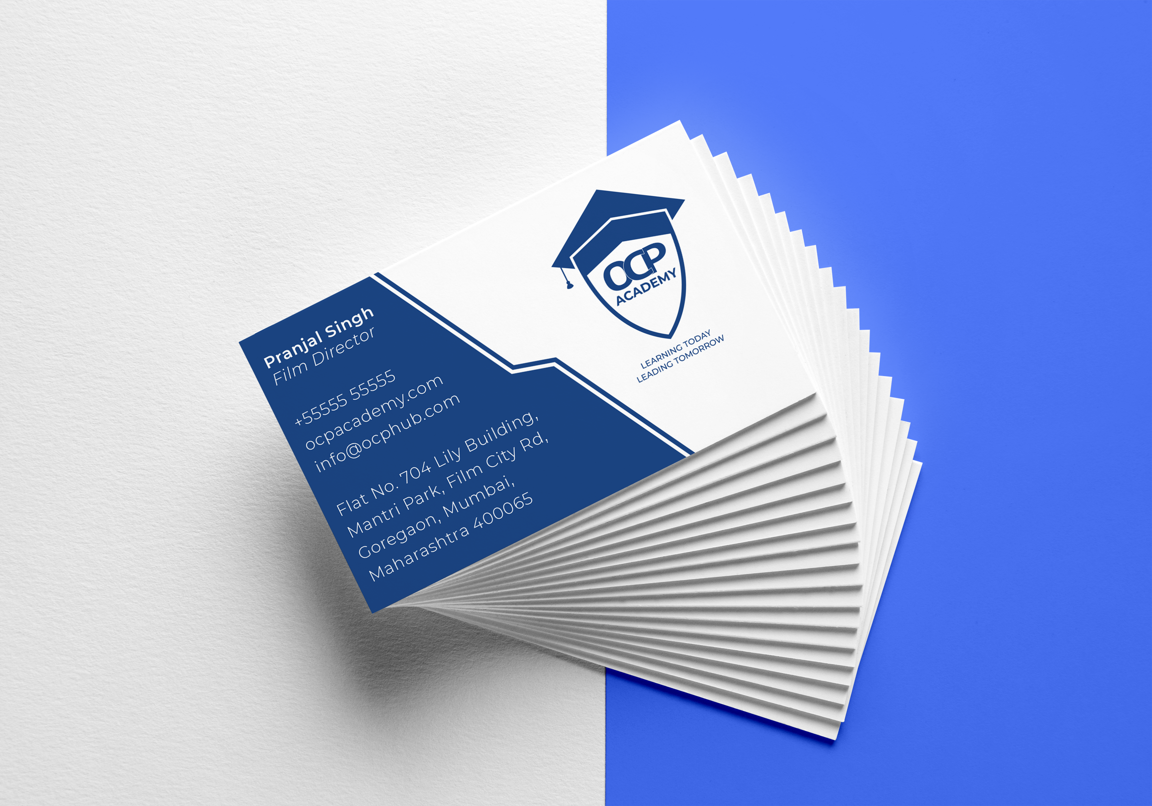
I delivered a full identity system, including mockups, a style guide, and brand-ready assets.
The updated logo elevated the brand's digital presence and boosted recognition across its platforms. Within weeks of the rebrand, OCP ranked #1 in search for its name and received overwhelmingly positive feedback from students and staff alike.